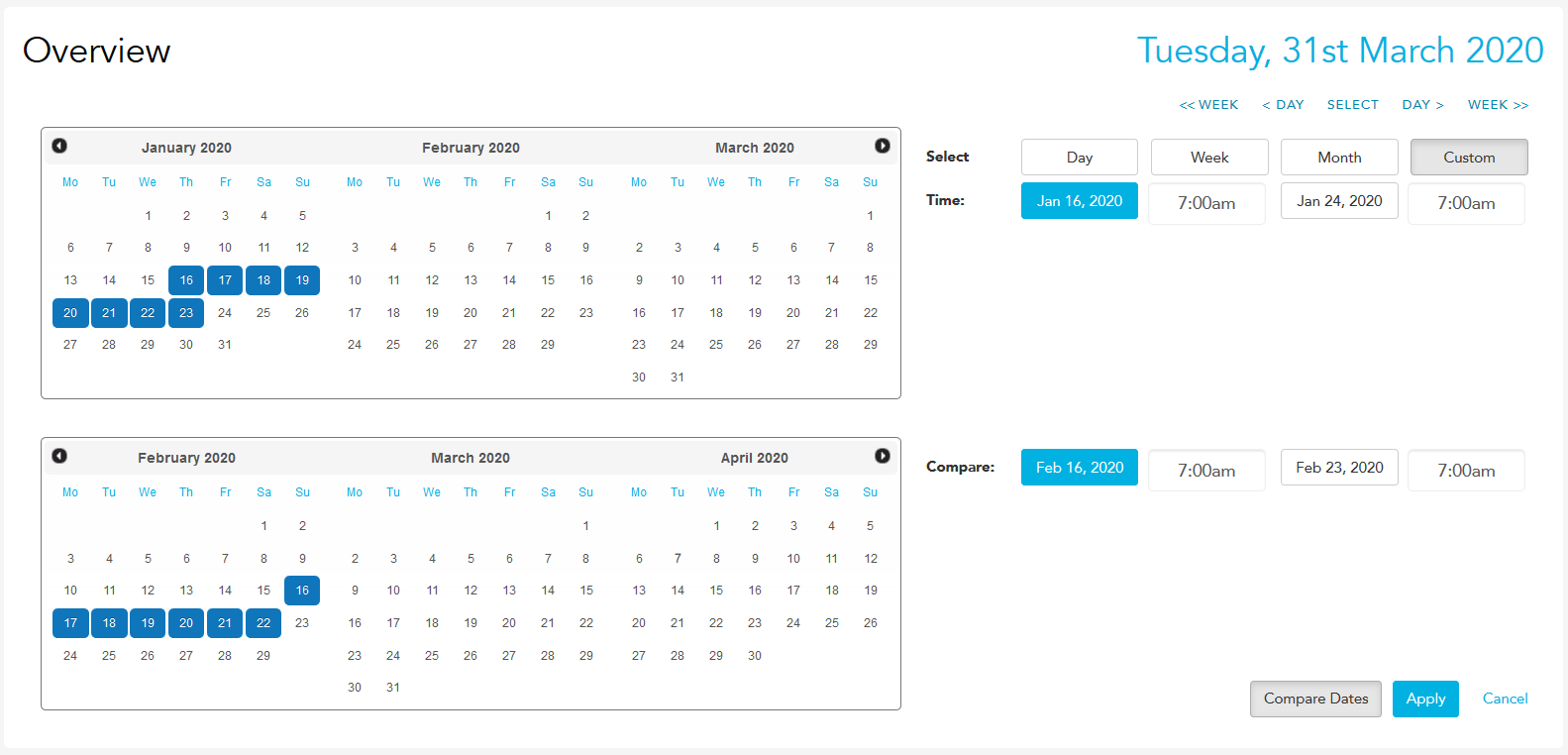
You'll need Reports permission for all relevant sites to view this page. If you don't have access to this module, ask someone with Manager's permission to update your user permissions.
Your data importer will need to be running and connected to the internet on your server computer for information to show in this report.
To get the most out of this report, it'll help if you've created a budget in Loaded.
If you'd like to customise the time frame of any of these reports, follow the steps for setting a custom date range.
To access, head to Reports and Multisite. If you have multiple sites loaded to your username, you can check all of them at once and compare sites against each other in the Multisite module.
Overview
The top of the overview page has a graph that maps each site's daily sales against the others; you can see the dollar value at each half-hour period across the day by hovering over the line.
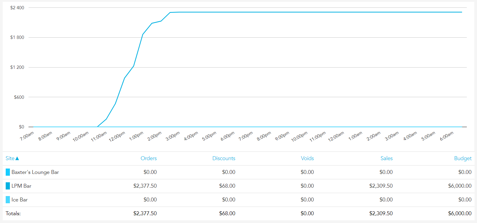
Underneath this, each site's orders, discounts, sales, voids, and budget for the day, week, or month are listed, along with a total for the group as a whole.
Sales
The Sales bar graph shows the total sales and average transaction value at each site; you can see the dollar figure for this by hovering over the bar for each site.
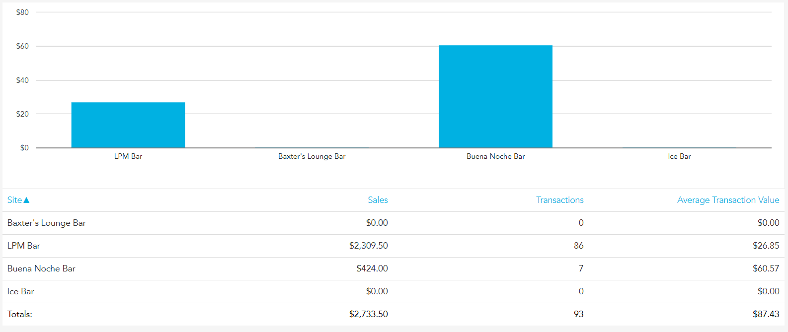
Underneath this, each site's total sales, number of transactions, and average transaction value are listed, along with a total for the group as a whole.
Food vs Beverage
The Food vs Beverage pie graph shows the percentage of sales data for both food and beverage sales for the group as a whole. You can see the dollar value for these by hovering over each section of the pie graph.
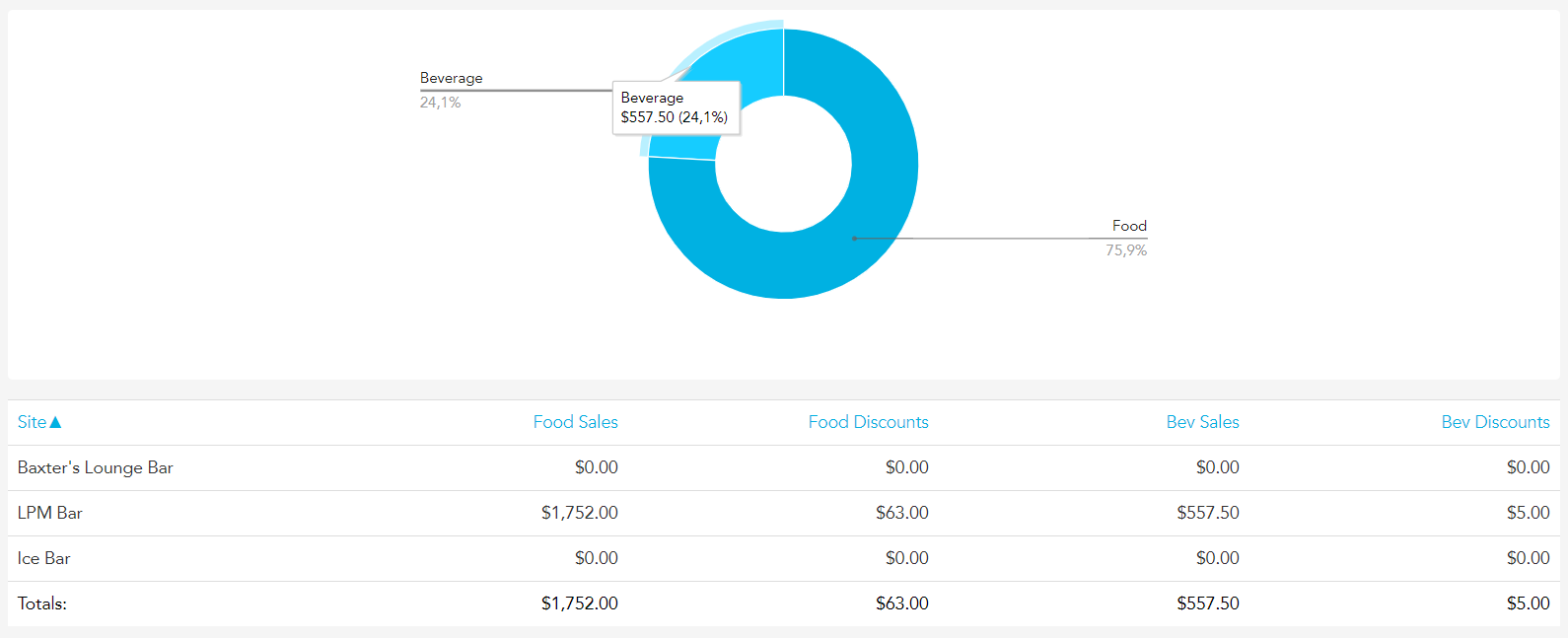
Underneath this, each site's food and beverage sales and discounts are listed, along with a total for the group as a whole.
Discounts
The discounts bar graph maps discounts as a percentage of sales for each site in the group. You can see this data by hovering over the bar for each site.
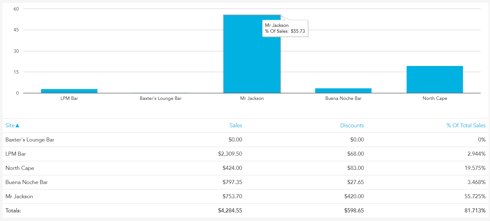
Underneath this, each site's sales, discounts, and percentage of sales data are listed, along with a total for the group as a whole.
Reconciliation
The reconciliation bar graph maps the cash variances for each site in the group. You can see this as a dollar figure by hovering over the bar for each site.
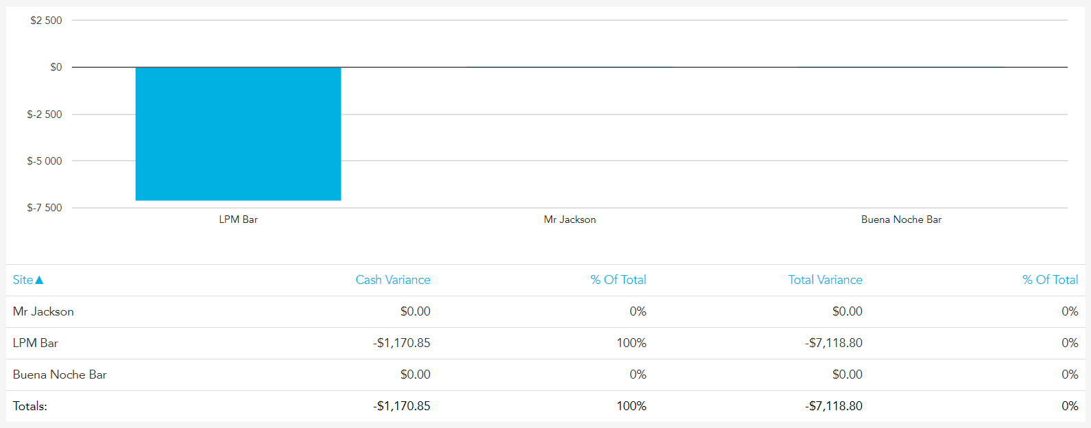
Underneath this, each site's cash variance, total variance, and percentage of the total are listed, along with a total for the group as a whole.
Wage – Food vs Beverage
The wage bar graph maps both food and beverage wages for each site in the group. You can see this as a dollar figure by hovering over the bars for each site.
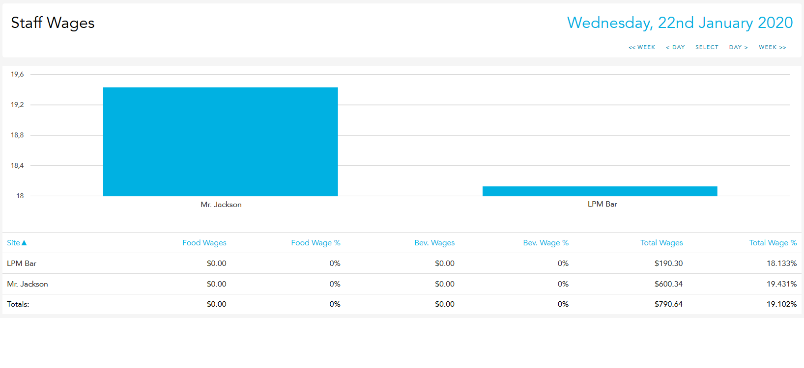
Underneath this, each site's food and beverage wage cost, wage percentage, and total cost and total percentage are listed, along with a total for the group as a whole.
Wage – Roster
The wage bar graph maps rostered wage cost against the actual wage cost for each site in the group. You can see the cost as a dollar figure by hovering over the bars for each site.
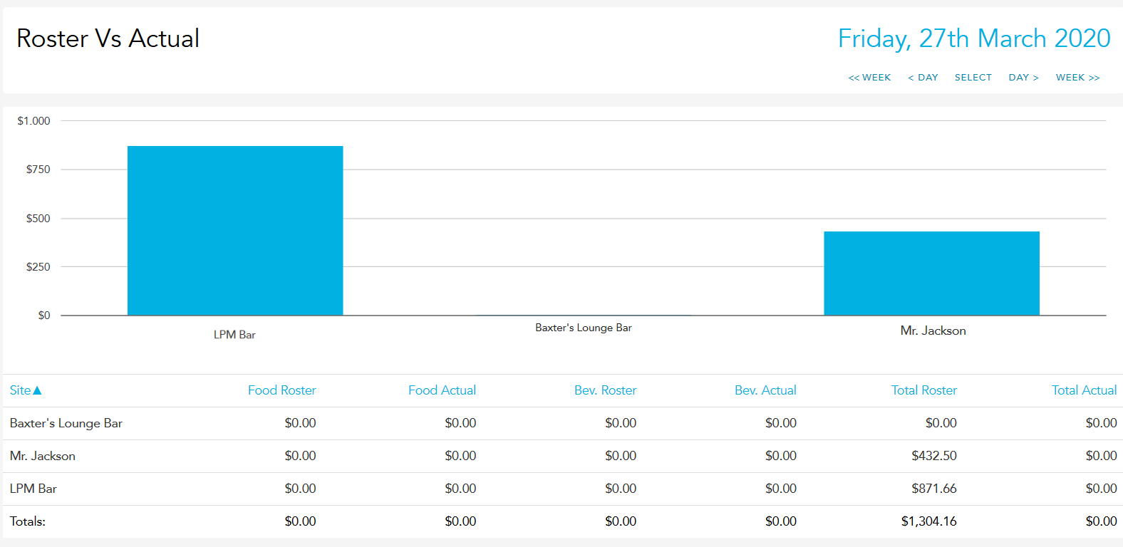
Underneath this, each site's food, beverage, and total wage costs are listed as a dollar figure and as a percentage of sales, along with a total for the group as a whole.
Products
The products pie graph maps out all ordered products as a percentage of total orders; you can see the dollar figure for each by hovering over each section of the pie graph.
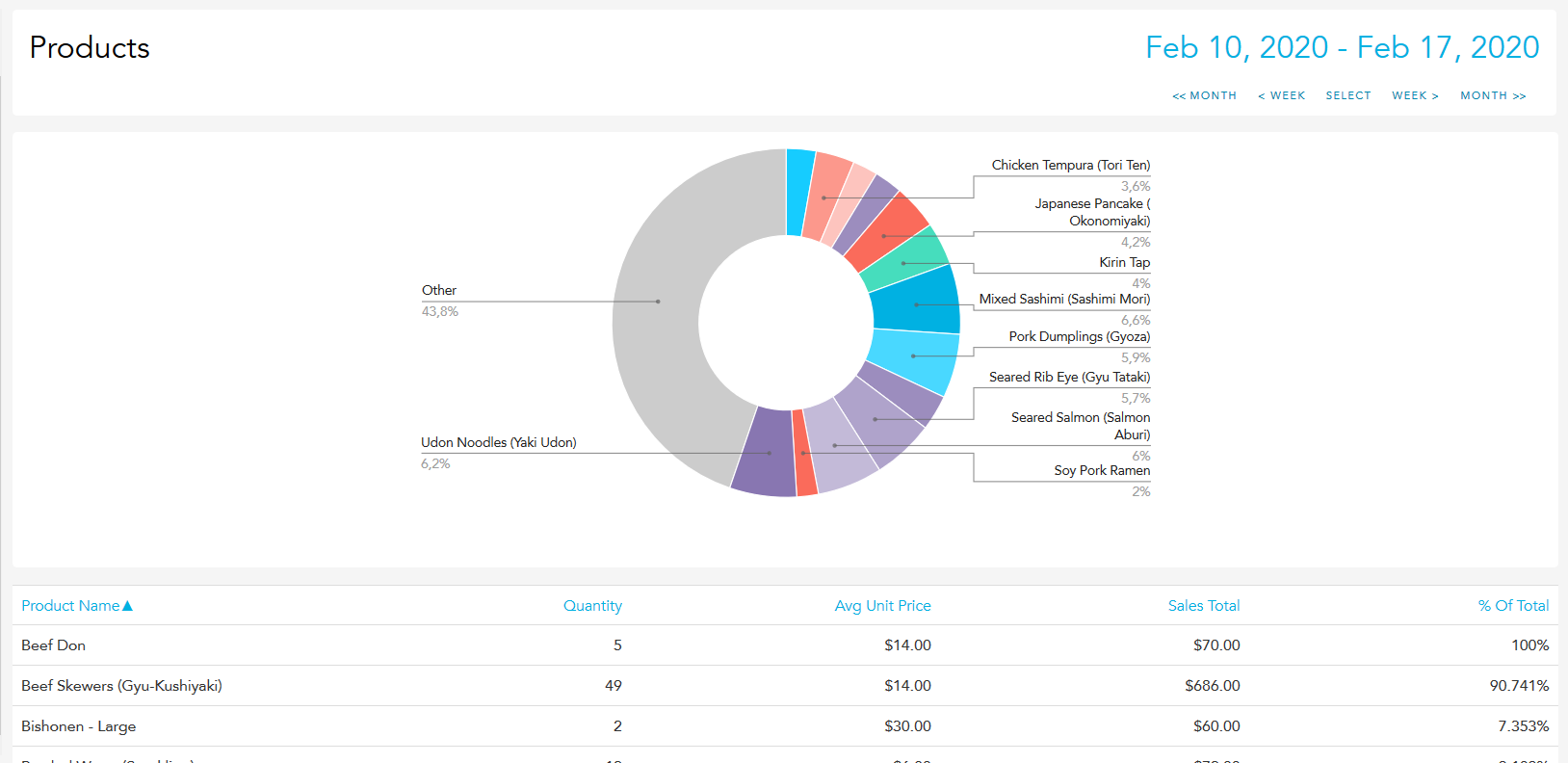
Underneath this, all products are listed along with the quantity ordered, average price, sales total, and percentage of total.
Stock Purchases
The purchases pie graph maps out all the stock items purchased by all sites as a percentage of total purchases; you can see the dollar figure for each by hovering over each section of the pie graph.
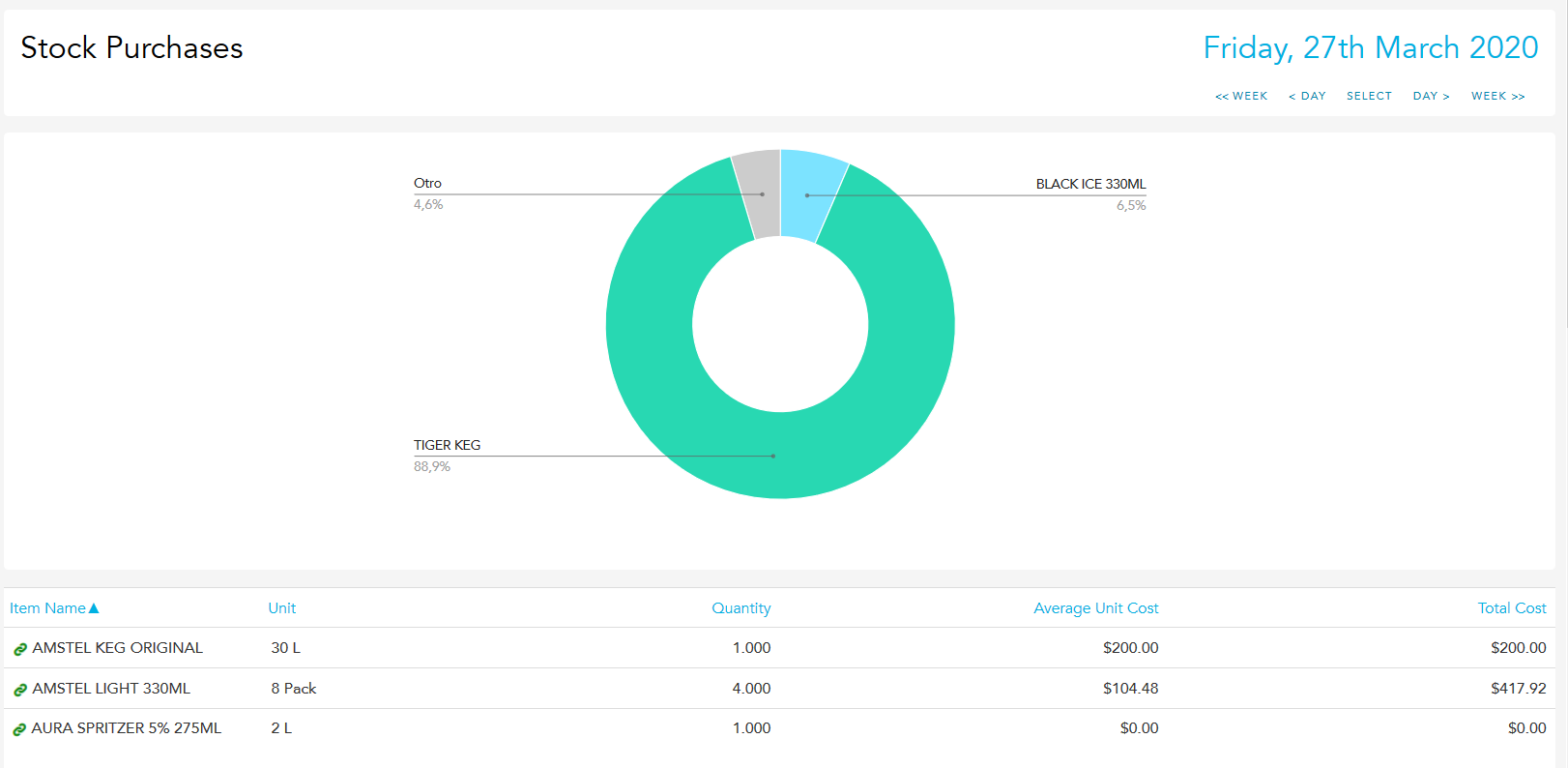
Underneath this, all stock items are listed with the quantity purchased, average cost, and total cost, along with a total for the group as a whole.
For any Multisite report, you can use the "Compare" option to compare data from two periods.